Overwatch 2's Hazard: Design Controversy and Punk Rock Legacy
Overwatch 2's new tank, Hazard, sparks debate over character design and punk rock aesthetics, captivating hero shooter fans with controversy.
In the wild world of hero shooters, character design is everything—it's the make-or-break factor that determines whether a hero becomes an instant main or gets left in the spawn room. Overwatch 2's latest tank addition, Hazard, has been stirring up quite the commotion in the community. While his kit brings some serious brawl potential to the table, his visual design has players scratching their heads and asking, "Wait, that's it?" The dude's been in development since the original Overwatch days, but some fans feel like his final look doesn't quite hit the punk rock vibe he's supposed to represent.
🎸 Hazard's Backstory: Rebel With a Cause
Hazard's origin story reads like a cyberpunk novel—growing up through tough times before finding his place with the Phreaks, an anti-establishment group that's all about body modding and sticking it to the man. This rebel fighter background screams for a design that's gritty, edgy, and unapologetically punk. But here's the tea: some players feel like Hazard's final look is more "mall punk" than "anarchist revolutionary."
Key elements of his supposed aesthetic:
-
Punk rock influences 🎵
-
Cyberpunk augmentation themes 🤖
-
Anti-establishment rebel vibes ✊
The Phreak Legacy: What Could Have Been
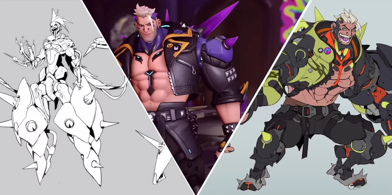
Turns out, Hazard and his Phreak crew have been lurking in Blizzard's concept art since the Prometheus days (that's the project that eventually became Overwatch, for you newbies). The original Phreak design featured that classic punk rock look with a killer mohawk and green highlights that would make any cyberpunk character jealous. This early version had that rough-around-the-edges aesthetic that screams "I'm here to cause trouble."
What fans expected vs. what they got:
| Expected Features | Actual Design |
|---|---|
| Prominent mohawk | More subdued hairstyle |
| Worn-out armor | Cleaner, more polished look |
| Edgy punk aesthetic | Conventional attractive design |
🎨 Concept Art Revelations: The Road Not Taken
When artist Kai Chang's concept art recently surfaced, it was like opening Pandora's box of what-could-have-been. The early concepts showed Hazard as everything from a scorpion-like creature with multiple legs and a stinger tail to a neon-green armored beast straight out of Cyberpunk: Edgerunners. These designs had that distinctive silhouette that makes Overwatch heroes instantly recognizable—something that Hazard's final, more Reinhardt-esque outline seems to lack.
Notable concept art variations:
-
🔥 Scorpion-inspired mechanical design
-
💚 Black and neon green armor sets
-
Spiky cloak and shield concepts
-
More distinctive silhouette options
Scottish Roots: The Thistle Connection
Now, it's not all doom and gloom for Hazard's design. Some sharp-eyed fans have noticed that his spikes and purple highlights might actually be a nod to his Scottish heritage. The thistle, Scotland's national flower, is known for its resilience and courage—traits that definitely fit Hazard's tank role. So maybe there's more method to the madness than initially meets the eye?
Positive aspects of his current design:
-
✅ Conventionally attractive (hey, that matters to some players!)
-
✅ Cultural references through Scottish symbolism
-
✅ Clear frontline bruiser appearance
-
✅ Distinct enough from Junker Queen (another mohawk-rocking tank)
🤔 Community Reactions: Mixed Feelings All Around
The Overwatch community is, as always, divided on Hazard's look. Some players are totally digging his more polished appearance, while others are mourning the loss of that gritty punk aesthetic they were promised. It's the classic case of "you can't please everyone" in the hero shooter world.
Community sentiment breakdown:
-
👍 Pro: "He looks great and fits the Scottish theme!"
-
👎 Con: "Where's the punk rock edge we were promised?"
-
🤷 Neutral: "Give it time—new designs always grow on us"
-
💭 Nostalgic: "I miss the original Phreak concept so much!"
️ The Test of Time: Will Hazard Grow on Us?
History shows that Overwatch heroes often face initial design criticism before winning over the community. Remember when people complained about Sigma's bare feet or Baptiste's haircut? Now they're beloved members of the roster. Hazard might just need some time to prove himself both in gameplay and in our hearts.
At the end of the day, Hazard's design controversy highlights something fundamental about hero shooters: players form deep connections with these characters, and visual design is just as important as gameplay mechanics. Whether he becomes a fan favorite or remains a point of contention, one thing's for sure—Hazard has definitely got people talking. And in the world of Overwatch 2, that's half the battle won. 💥
Comments